Nel 2021 abbiamo esplorato la lingua italiana, ma anche dei gioielli culturali.
In 2021 we explored the Italian language, but also some cultural jewels.
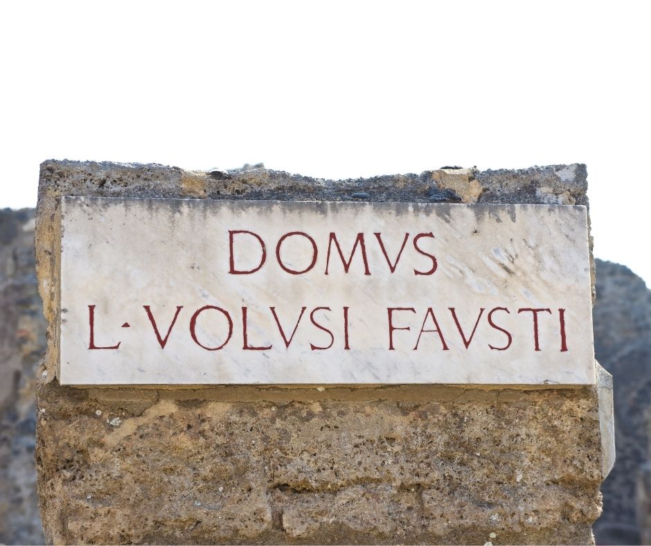
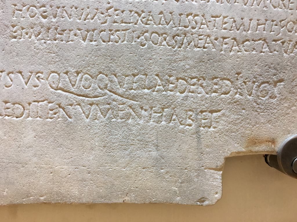
“Domus volusi fausti”, una scritta davanti a una casa tra le rovine di Pompei – “I wanted a happy home”, a sign in front of a house in the ruins of Pompeii.
Rintracciamo il percorso fatto insieme quest’anno attraverso la bellissima lingua italiana, la magica cultura, l’infinito vocabolario e, dulcis in fundo, i viaggi nella magnifica terra italiana.
Quale ti è piaciuto di piu?
Let’s trace the journey made together this year through the beautiful Italian language, the magical culture, the infinite vocabulary and, last but not least, traveling to the magnificent Italian land. Which one did you like the most?
La letteratura era una delle mie materie preferite a scuola. Tuttavia, quando ero più giovane non ero consapovole del fatto che i nostri libri di scuola trascurassero le scrittrici italiane. Leggevamo Machiavelli, Dante, Calvino, ma nei nostri pesanti volumi non c’era menzione di Alda Merini, Natalia Ginzburg, Elsa Morante, Anna Maria Ortese, Matilde Serao, Maria Messina,….
Pensavo che non esistessero scrittrici italiane ed è un peccato che le giovani ragazze italiane in particolare non siano a conoscenza delle menti creative femminili del nostro passato. Ho scoperto Maria Messina solo di recente, e mi chiedo quanto avesse potuto essere influente il suo lavoro durante i miei anni formativi.
Literature was one of my favorite subjects in school. However, little did I know when I was younger that our school books neglected to include Italian female writers. We read Machiavelli, Dante, Calvino, but there was no mention in our thick tomes of Alda Merini, Natalia Ginzburg, Elsa Morante, Matilde Serao, Maria Messina,…. I used to think that there weren’t any female Italian writers and it is a shame that young Italian girls in particular are not aware of the female creative minds of our past. I only discovered Maria Messina recently, and it makes me wonder how influential her work could have been during my formative year.
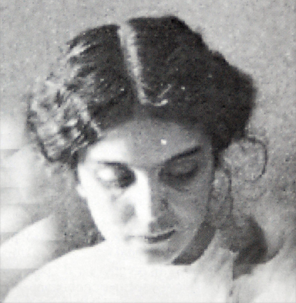
Maria Messina nacque in provincia di Palermo nel 1887 e fu autodidatta. Il fratello maggiore la incoraggiò ad intraprendere la carriera di scrittrice e all’età di ventidue anni iniziò un’intensa corrispondenza con Giovanni Verga. Pubblicò poi una serie di racconti tra il 1909 e il 1921, tra cui una novella, Luciuzza, pubblicata nel 1914 su una rivista letteraria chiamata Nuova Antologia, grazie al sostegno di Verga. Per molti anni visse a Mistretta, un piccolo paese adagiato sui Monti Nebrodi, dove sono ambientate molte delle sue storie.
Sembra che il suo nome abbia iniziato a svanire lentamente e gradualmente dopo la sua morte prematura, e di conseguenza i suoi libri sono andati fuori stampa, dimenticati dalla storia letteraria del Novecento. Per fortuna nel 1980 fu riscattata dall’oblio e riscoperta da Leonardo Sciascia, tanto che molte sue opere sono state ripubblicate. Ora è tra le scrittrici più celebri del primo Novecento, ed è inclusa nel progetto LeAutricidellaLetteraturaItaliana. Dal 1986 i suoi libri sono stati tradotti in francese, tedesco, inglese e spagnolo.
Maria Messina was born in the province of Palermo in 1887 and was self-educated. Her older brother encouraged her to begin a writing career and at the age of twenty-two she began an intense correspondence with Giovanni Verga. She then published a series of short stories between 1909 and 1921, among which a novella, Luciuzza, published in 1914 in a literary magazine called Nuova Antologia, thanks to Verga’s support. For many years, she lived in Mistretta, a small town nestled in the Nebrodi Mountains, where many of her stories are set. It seems that her name started to fade slowly and gradually after her premature death, so her books went out of print. Forgotten by the literary history of the twentieth century. Luckily in 1980 she was redeemed from oblivion and rediscovered by Leonardo Sciascia so that many of her works were republished. She is now among the most celebrated woman writers of the early 20th century, and is included in The Women Authors of Italian Literature project. Since 1986 her books have been translated into French, German, English, and Spanish.
Tra i temi principali di Messina vi sono l’isolamento e l’oppressione delle giovani donne in Sicilia e nella cultura siciliana. Inoltre, i suoi scritti si concentrano sul dominio maschile e sulla sottomissione femminile che sono inerenti alle relazioni affettive. Il romanzo “La casa nel vicolo” segnò una svolta importante nella scrittura messinese, poiché si avvaleva di condizioni psicologiche. Alcuni credono che Messina non fosse una femminista poiché presentava l’oppressione delle donne come inevitabile e ciclica. Anche se fosse, le sue donne rappresentano potenti dichiarazioni di sfida.
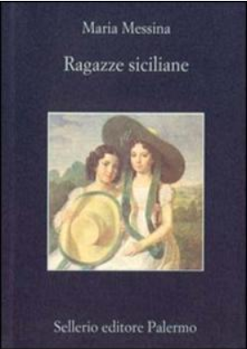
Di recente ho letto “Ragazze siciliane”, pubblicato originariamente nel 1921 dall’editore Le Monnier di Firenze, che comprende 8 racconti i cui temi riguardano, come commenta la stessa autrice in una nota dell’autunno 1920, “figlie di poveri dipendenti e piccoli proprietari […] che abitano in paesini piccoli, chiusi e remoti, dove l’abitudine scandisce un ritmo uguale, dove le notizie e i rumori arrivano tardi, come voci attutite dalla lontananza”. Eppure, anche loro, «pur continuando a camminare nei sentieri tracciati dall’esperienza degli anziani, sognando bambini da cullare, una casa da gestire… parlano del desiderio di libertà».
Among Messina’s main themes are the isolation and oppression of young women in Sicily and in Sicilian culture. Additionally, her writing focuses on male dominance and female submission that are inherent to emotional relationships. The novel “La casa nel vicolo” marked an important turning point in Messina’s writing, as it made use of psychological conditions. Some believe Messina was not a feminist since she presented the oppression of women as inevitable and cyclical. Even so, her women represent powerful statements of challenge. I’ve recently been reading “Sicilian girls”, originally published in 1921 by the publisher Le Monnier of Florence, which includes 8 short stories whose themes concern, as the author herself commented in a note dated autumn 1920, “daughters of poor employees and small owners […] who live in small, closed and remote villages, where habit marks an equal rhythm, where news and noise arrive late, like voices muffled by distance “. Yet, even they, “while continuing to walk in the paths traced by the experience of the elderly, dreaming of babies to be cradled, a house to be managed … they speak of the desire for freedom.”
Maria Messina apre le porte di un mondo mediocre, chiuso nel proprio egoismo e resistente a ogni cambiamento, un mondo piccolo borghese la cui unica preoccupazione è salvare la faccia di fronte alla comunità di cui fa parte. Non è facile evadere da questo universo ristretto e spesso meschino, soprattutto per chi, come le donne che descrive, non è in grado di esercitare la propria libertà interiore. Le “prigioni” che descrive, che racchiudono sia le vittime che i persecutori, sono i circoli chiusi all’interno dei quali i protagonisti si vedono vivere. Nella rinuncia, nella resa, nell’accettazione di ciò che è considerato ineluttabile, non c’è debolezza o accidia, ma il segno di una realtà da scontare.
Dopo aver letto in “Ragazze siciliane” il racconto straziante di una bambina di nome Luciuzza, abbandonata nelle mani dei parenti dopo la prematura scomparsa della madre, mi chiedo quanto di quel mediocre mondo dipinto da Maria Messina appartenga al passato e quanto sia in realtà abilmente nascosto ai nostri giorni.
Maria Messina opens the doors of a mediocre world, closed in its own selfishness and resistant to any change, a world of petty bourgeois whose only concern is to save face in the face of the community to which it belongs. It is not easy to escape from this restricted and often petty universe, especially for those who, like the women she describes, are unable to exercise their inner freedom. The “prisons” she describes, which enclose both the victims and the persecutors, are the closed circles within which the protagonists see themselves living. In the renunciation, in the surrender, in the acceptance of what is considered ineluctable, there is no weakness or sloth, but the sign of a reality to be discounted. After reading in “Sicilian girls” the wrenching short story of a little girl named Luciuzza, abandoned to her relatives after the premature death of her mother, I wondered how much of that mediocre world depicted by Maria Messina belongs to the past and how much is actually shrewdly concealed in our modern day.
Regala un libro. Soggiorni gratis a Macchiagodena, un borgo Molisano
L’idea per rilanciare turismo e cultura e riscoprire la lentezza nasce nel comune di Macchiagodena, un borgo del Molise, in provincia di Isernia. Basterà pagare consegnando un libro, magari il proprio preferito, per ricevere in cambio soggiorni gratis. Il comune mette a disposizione stanza in Bed and Breakfast e Agriturismi. Qualsiasi tipo di volume è valido! Un romanzo, un libro di poesie, un libro per bambini…
Ascolta la versione audio (7 minuti) / Listen to the audio version (7 minutes):
Dicono che bere vino rosso ogni tanto faccia bene alla salute. Ammetto che quest’anno ne ho bevuto più del solito, senza esagerare ovviamente.
Avevo in programma di festeggiare il compleanno di mio padre insieme a lui a settembre stappando una bottiglia di Tintilia del Molise, il nostro vino preferito, ma purtroppo la vita ha deciso diversamente e non ne avremo più l’occasione.
Nell’antichità il vino, “Nettare Divino”, rappresentava l’allegoria di benessere, prosperità e abbondanza. Speriamo sia vero!
Bacco, chiamato Dioniso nell’antichità greca, è il dio del vino, delle feste e della perdizione. Dato il suo carattere energico e chiassoso, veniva chiamato Bacco, che in greco significa “clamore – baccano”, nome adottato dalla cultura romana proprio per identificare Dioniso. Molti artisti lo hanno reso protagonista delle loro opere. Vediamone alcune.
Ecco un pdf con le parole del vino / Here’s a pdf with a list of wine words :
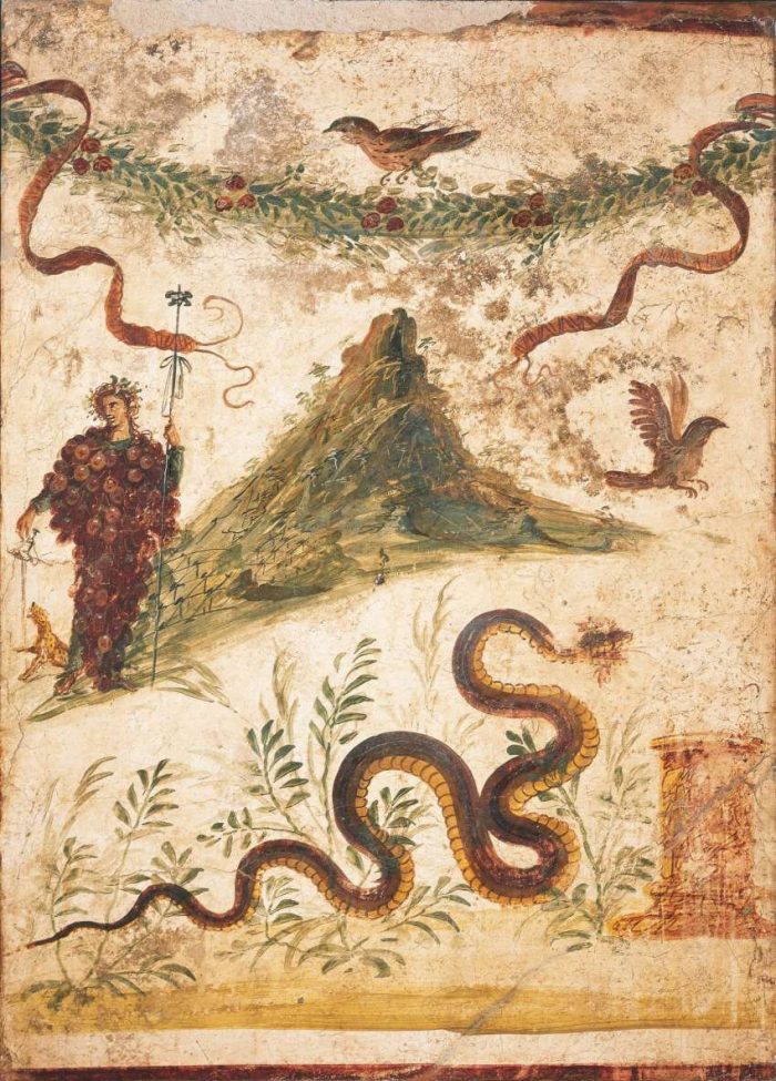
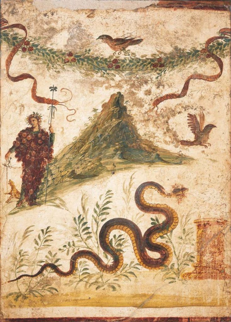
Bacco e il Vesuvio – L’affresco raffigura Bacco con il corpo ricoperto da acini e un alto monte isolato, con le pendici ricoperte da filari di viti. Potrebbe essere il Vesuvio prima dell’eruzione del 79 d.C., e dunque con una sola cima, oppure il monte Nisa dove, secondo la leggenda, Dioniso sarebbe stato allevato.
Affresco Bacco e il Vesuvio – Pompei
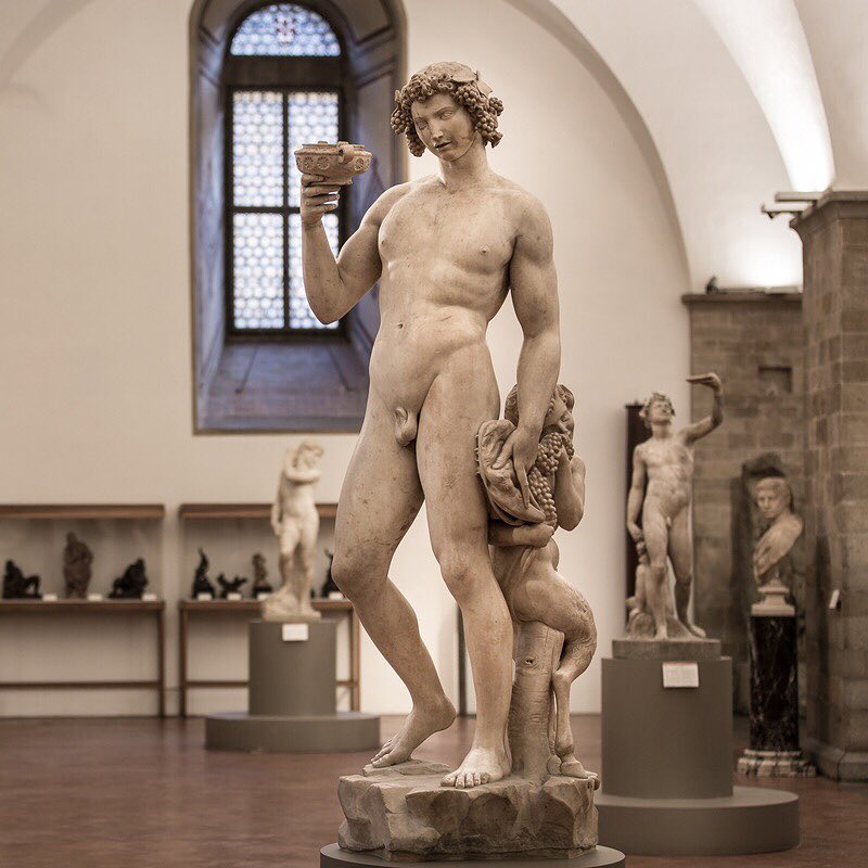
Il Bacco di Michelangelo – E’ rappresentato in una veste giovanile con in mano una coppa, mentre sta barcollando a causa dell’ubriachezza. Il forte realismo della statua rende il movimento di Bacco ubriaco fluido e verosimile. Un piccolo satiro si trova dietro Bacco, il quale approfitta per mangiare dell’uva di nascosto nell’attimo di debolezza del dio. Includerlo all’interno della composizione serve ad indurre lo spettatore a girare attorno alla statua, apprezzandone ogni singolo dettaglio.
Michelangelo Buonarroti – Il Bacco, 1496–1497
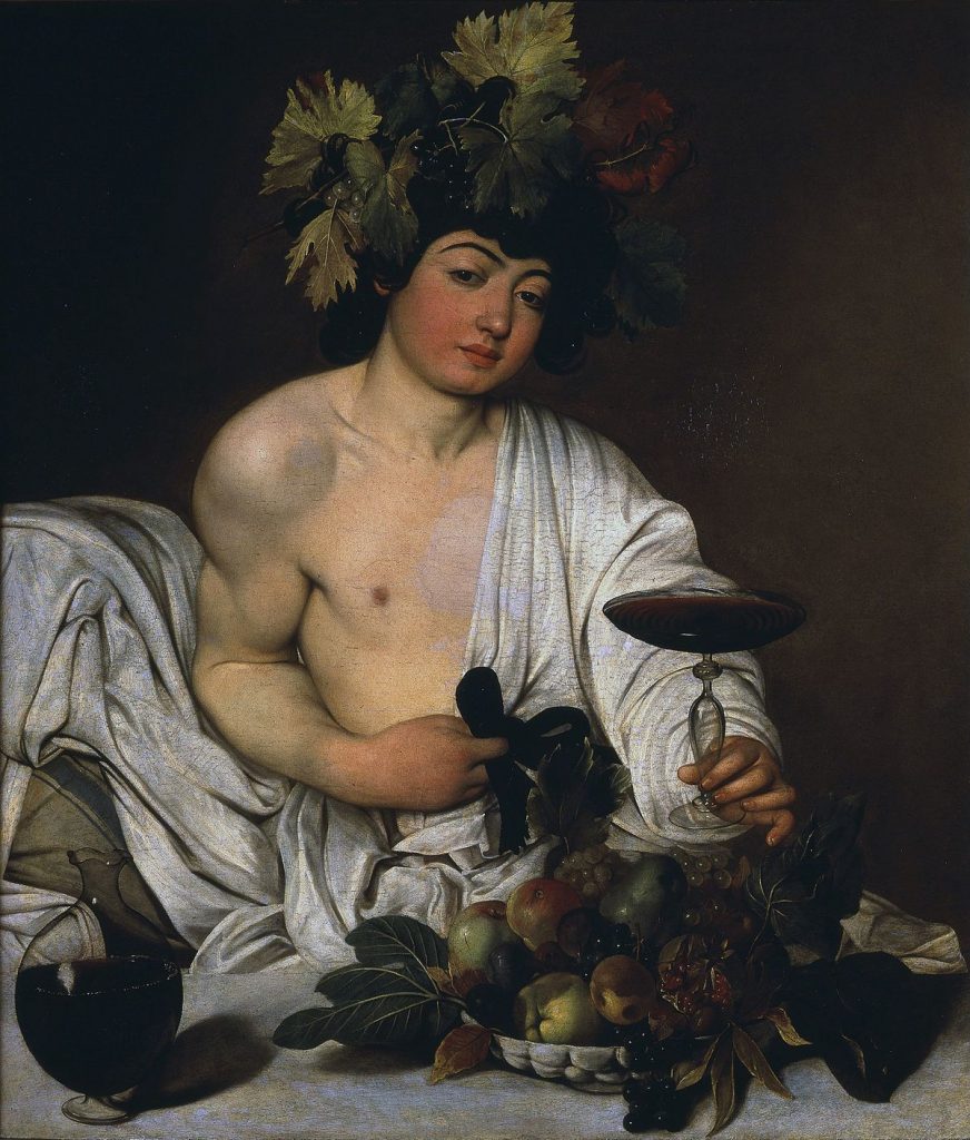
Il Bacco adolescente di Caravaggio: “Nel dipingere il Bacco, Caravaggio avrebbe potuto, e per alcuni dovuto, affrontare il soggetto mitologico secondo la buona tradizione rinascimentale. Il giovane appare ben lontano dall’essere una classica figura idealizzata. Il vero soggetto del dipinto sarebbe, insomma, la semplice rappresentazione di uno scherzoso travestimento. Caravaggio, prendendosi gioco della gloriosa tradizione classica e rinascimentale, facendosi beffa del pubblico, avrebbe ritratto un suo amico un po’ stordito dai fumi dell’alcol, chiedendogli di tenere in mano un bicchiere di vino e posando davanti a lui della frutta di qualche giorno.” – ArteSvelata.it
Michelangelo Merisi da Caravaggio – Bacco adolescente, 1597
Ascolta il podcast di Arte Svelata sul Bacco di Caravaggio/ Listen to the podcast by Arte Svelata about il Bacco by Caravaggio:
Il Bacco di Arianna: alcuni dipingono utilizzando colori, tempere, acrilico, acquerello, matite e altri come Arianna Greco invece scelgono il nettare degli dei per creare quella che è stata battezzata arte enoica, capace di dare vita a profumatissimi capolavori enocromatici. Come nasce questa passione di Arianna? “Dipingere con il vino è una tecnica particolarissima e di non facile realizzazione in quanto necessita di abilità tecnica e di conoscenze in campo chimico. Sono opere d’arte che hanno i profumi e i colori dei vitigni che nascono nella nostra Italia e in particolar modo nella mia Puglia anche se spesso e volentieri utilizzo anche vini piemontesi come il Barolo, di cui amo tutto. Il vino posto su tela tende ad evolvere a suo modo, si ossida come farebbe in Barrique o in bottiglia e ciò grazie a reazioni tra antociani e tannini con conseguenti viraggi di colore. All’occhio osserviamo una maturazione, da color rosso porpora, color viola, rosso rubino verso sfumature tendenti al granato, al mattonato, sfumature decisamente più calde e più affascinanti. Proprio grazie a questo particolarissimo aspetto evolutivo che, normalmente non si verifica in altre forme d’arte, le mie opere sono state paragonate al quadro di Dorian Grey con la differenza che mentre questo invecchiando peggiora, i miei dipinti, invecchiando, assumono maggior fascino.”
Arianna Greco – Il Bacco di Arianna, 2013
…Dopo tanto chiacchierare di vino è ora di stappare una bottiglia. Come sai, la degustazione del vino consiste in un esame olfattivo e in un esame visivo. Ecco come vengono descritti 4 vini italiani:
Tintilia del Molise DOC: colore rosso rubino, intenso, con riflessi violacei. Il profilo olfattivo del vino è vinoso, intenso, piacevole, caratteristico e al palato risulta secco, armonico, morbido. Si abbina bene con un buon piatto di penne al sugo.
Montepulciano d’Abruzzo: Al secondo posto tra i vini DOCG più venduti. Colore Rosso rubino intenso. Profumo fruttato di mora lievemente aspra, di frutti rossi maturi, tra cui il ribes rosso selvatico, e spezie. Caratteristica principale è l’aroma di liquerizia, (si dice”liqueriziaceo”), e amarascato. A volte il fondo è ammandorlato e dai sentori speziati. Gusto Mediamente tannico, di buon corpo, ottima struttura.
Chianti Classico DOCG: ha colore rubino brillante, tendente al granato e odore profondamente vinoso. Il gusto è asciutto, sapido tendente con il tempo al morbido vellutato.
Il Nero d’Avola si presenta alla vista di un gradevole rosso rubino, più o meno intenso a seconda delle tipologie del vigneto, della sua giacitura e dell’invecchiamento, ha un gusto con sentori di bacca, di ciliegia, prugna, nelle migliori zone presenta note speziate e balsamiche.
They say that drinking red wine every now and then is good for your health. I admit that this year I drank more than usual, obviously without exaggerating.
I had planned to celebrate my father’s birthday with him in September by uncorking a bottle of Tintilia del Molise, our favorite wine, but unfortunately life has decided otherwise and we won’t have the opportunity anymore.
In ancient times, wine, “Divine Nectar”, represented the allegory of well-being, prosperity and abundance. Let’s hope it’s true!
Bacchus, called Dionysus in Greek antiquity, is the god of wine, festivals and perdition. Given his energetic and noisy character, he was called Bacchus, which in Greek means “clamor / baccano”, a name adopted by Roman culture precisely to identify Dionysus. Many artists have made him the protagonist of their works. Let’s see some of them.
Bacchus and Vesuvius – The fresco depicts Bacchus with his body covered with berries and a high isolated mountain, with the slopes covered with rows of vines. It could be Vesuvius before the eruption of 79 AD, and therefore with only one peak, or Mount Nisa where, according to legend, Dionysus would have been raised. Michelangelo’s Bacchus – He is represented in a youthful robe holding a cup, while he is staggering due to drunkenness. The strong realism of the statue makes the movement of a drunk Bacchus fluid and convincing. A small satyr is behind Bacchus, taking the opportunity to secretly eat grapes in the moment of weakness of the god. Including it within the composition serves to induce the viewer to walk around the statue, appreciating every single detail.
The adolescent Bacchus by Caravaggio: “In painting Bacchus, Caravaggio could have, and some should have, faced the mythological subject according to the good Renaissance tradition. The young man appears far from being a classic idealized figure. The true subject of the painting would be , in short, the simple representation of a joke in disguise. Caravaggio, making fun of the glorious classical and Renaissance tradition, teasing the public, would have portrayed a friend of his a little stunned by the fumes of alcohol, asking him to hold a glass of wine and placing a few days’ fruit in front of him. ” – ArteSvelata.it
The Bacchus of Arianna: some paint using colors, tempera, acrylic, watercolor, pencils and others, like Arianna Greco instead, choose the nectar of the gods to create what has been baptized wine art, capable of giving life to fragrant enochromatic masterpieces. How was this passion of Arianna born? “Painting with wine is a very particular technique and not easy to achieve as it requires technical skill and knowledge in the chemical field. They are works of art that have the scents and colors of the vines that are born in our Italy and especially in my region Puglia even if I often and willingly use Piedmontese wines such as Barolo, of which I love everything. The wine placed on canvas tends to evolve in its own way, oxidizes as it would in Barrique or in bottle and this thanks to reactions between anthocyanins and tannins with consequent color changes. To the eye we observe a ripening, from purple red, violet, ruby red towards shades tending to garnet, to brick, decidedly warmer and more fascinating nuances. Thanks to this very particular evolutionary aspect, that normally does not occur in other art forms, my works have been compared to the Dorian Gray painting with the difference that as he gets worse as he ages, my paintings take on more charm.”
…After a lot of chatting about wine, it’s time to uncork a bottle. As you know, wine tasting consists of an olfactory examination and a visual examination. Here is how 4 Italian wines are described:
Tintilia del Molise DOC: an intense ruby red color and violet reflections. The olfactory profile of the wine is vinous, intense, pleasant, characteristic and on the palate it is dry, harmonious, soft. It goes well with a good dish of penne with sauce.
Montepulciano d’Abruzzo: second place among the best-selling DOCG wines. Intense ruby red color. Fruity aroma with slightly sour blackberry, ripe red fruits, including wild red currant, and spices. The main feature is the aroma of licorice (called “liqueriziaceo”), and amarascato. Sometimes the base is almondy and with spicy scents. Taste is medium tannic, full-bodied, excellent structure.
Chianti Classico DOCG: it has a brilliant ruby color tending towards garnet and a deeply vinous aroma. The taste is dry, savory, tending to velvety soft over time.
Nero d’Avola appears to the sight of a pleasant ruby red, more or less intense depending on the type of vineyard, its position and aging, to the taste it offers hints of berries, cherry, plum, in the best areas it presents spicy and balsamic notes.
Qual è il tuo vino preferito? / What’s your favorite wine?
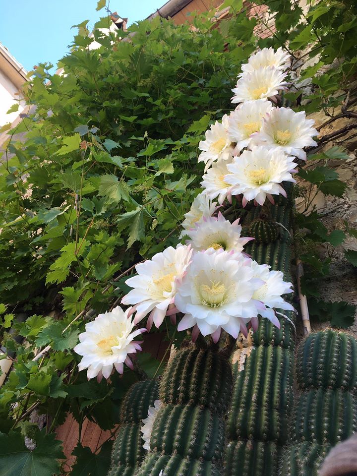
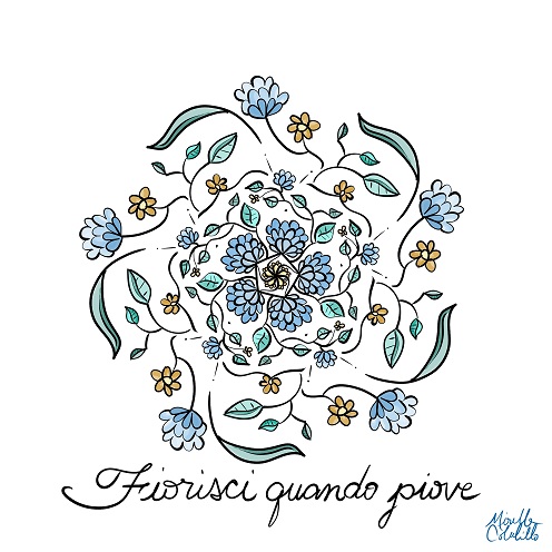
Un progetto dedicato alla memoria di mio padre e ai suoi bellissimi giardinetti. A project dedicated to the memory of my father and to his beautiful gardens
Il cactus fiorito di mio padre / My father’s cactus in bloom. – foto: Leo Colalillo
English follows –
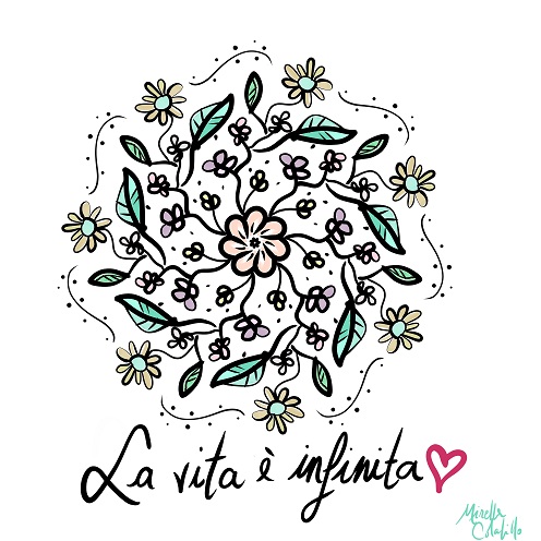
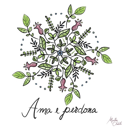
In queste ultime settimane ho trovato molto conforto nel disegnare visto che la lucidità per esprimermi in parole mi mancava.
Per alcuni dei miei disegni mi sono ispirata ai giardinetti di mio padre che quest’anno, la prima estate senza di lui, sono fioriti da soli in tutto il loro splendore. Ho disegnato dei mandala fioriti.
Pare che l’Italia si stia rialzando e tra un mese finalmente sarò lì. Spero che potrò dire che dopo quest’apocalisse le cose cambieranno finalmente per il meglio nel bel paese. Chi vivrà vedrà.
Nel frattempo continuerò a disegnare mandala e a trovare ispirazione nei fiori.
In the last few weeks I have found a lot of comfort in drawing since I was missing the clarity to express myself in words. For some of my drawings I was inspired by my father’s gardens ”giardinetti” which this year, the first summer without him, have bloomed alone in all their splendor. I designed flowery mandalas. It seems that Italy is getting back up and in a month I will finally be there.
I hope I can say that after this apocalypse things will finally change for the better in the beautiful country ”bel paese”. Time will tell.
In the meantime, I will continue to draw mandalas and to find inspiration in flowers.
Con affetto, Mirella
Altri articoli da leggere / More articles to read:
Ci sono così tante alternative per praticare l’italiano in modo divertente. Cucinare, leggere, ascoltare musica. Puoi trovare ispirazione da ciò che ti piace. Ti presento 10 idee!
There are so many alternatives to practice Italian in a fun way. Cooking, reading, listening to music. You can just find inspiration from what you enjoy. These are 10 ideas!
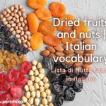
Secondo me imparare il vocabolario è più importante che sapere la grammatica. Le parole sono immediate nella comunicazione. Gli aggettivi in particolare sono quel gruppo di parole che ci aiutano a descrivere le cose. In questo caso conoscere la differenza tra “asciutto” e “secco” ci permette di dire se vogliamo per esempio la frutta secca o asciutta.
I think learning vocabulary is more important than learning grammar. Words are immediate in communication. Adjectives in particular are that group of words that help us describe things. In this case knowing the difference between “asciutto” and “secco” (dry) allows us to say if we want for example “frutta secca” or “frutta asciutta” .
Si possono ascolare i podcast ovunque anche mentre si viaggia. Ormai esistono centinaia di podcast su qualsiasi argomento. La cosa bella è che l’esercizio di ascolto aiuta a migliorare la pronuncia e ad aumentare il vocabolario oltre a rendersi più informati.
You can listen to podcasts anywhere even while traveling. There are now hundreds of podcasts on any topic. The great thing is that listening exercises help improve pronunciation and increase vocabulary as well as make you more informed.
Leggere: un’attività che aiuta non solo a godersi un po’ di meritato riposo, ma anche a migliorare la lingua e ad approfondire le conoscenze culturali dell’Italia.
Reading: an activity that helps not only to enjoy some well-deserved rest, but also to improve the language and deepen the cultural knowledge of Italy.
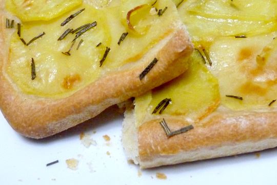
E ancora cibo!! Amo la pizza di patate. Conosci la canzone napoletana ‘A pizza’ di Giorgio Gaber? “Ma tu vuliv’a’pizza a’pizza a’pizza”… Pausa musicale: https://www.youtube.com/watch?v=eoIl5-2fYTo
And more food !! I love potato pizza. Do you know the Neapolitan song ‘A pizza’ by Giorgio Gaber:? “Ma tu vuliv’a’pizza a’pizza a’pizza … Music pause.
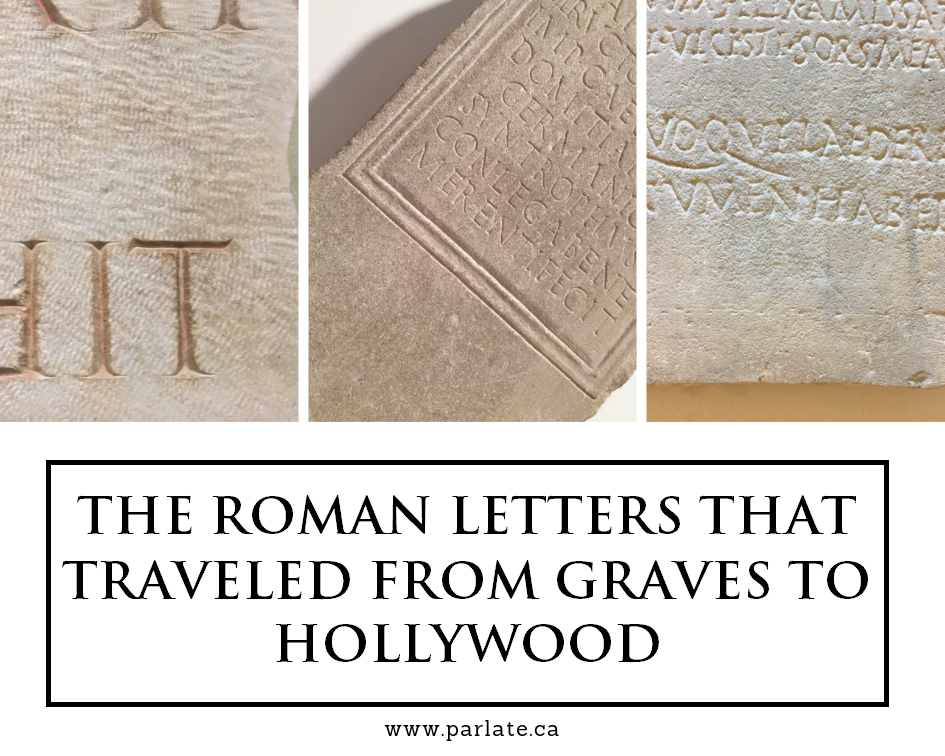
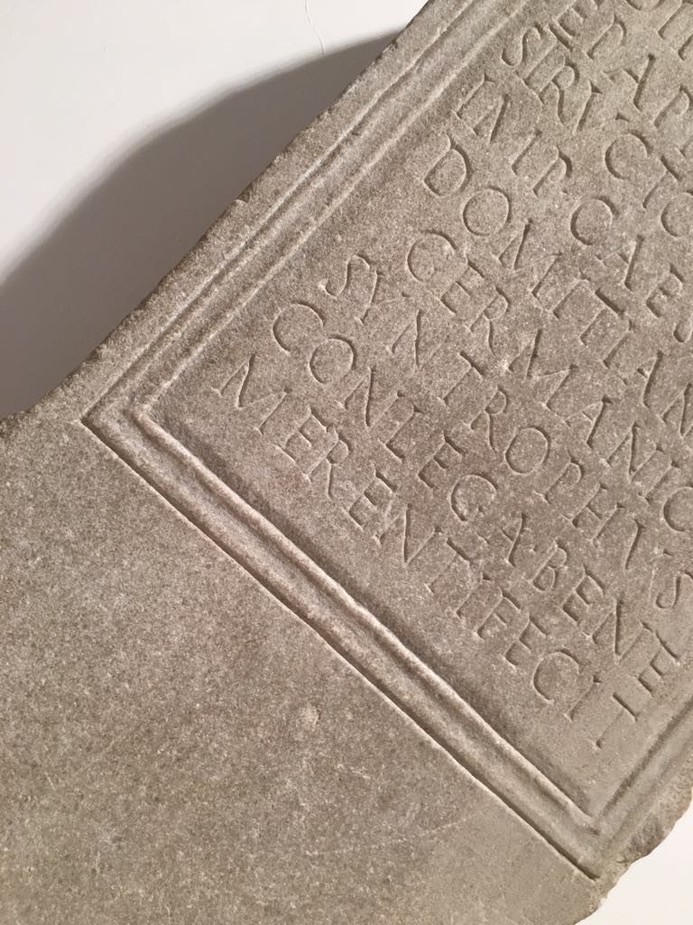
Quando viaggiamo in Italia troviamo molte scritte romane, che a volte non capiamo. Neanch’io che ho studiato il latino a scuola! Sai che una tipologia di lettera in particolare è molto usata nel cinema.
When we travel in Italy we find many Roman writings, which we sometimes don’t understand. I don’t either even though I studied Latin at school! Did you know that a particular type of letter is widely used in cinema.
Did you know that in Italian there’s la font (feminine) and il font (masculine)? Me neither! La font represents the name of the font, while il font is the technical file with all the typographic variations of la font … my brother, an expert in the field, explained it to me and talks to us here about a particular font, the Trajan.
Lo sapevi che in italiano esiste la font (femminile) e il font (maschile)? Neanch’io! La font rappresenta il nome del carattere, mentre il font è il file tecnico con tutte le variazioni tipografiche della fonte…me lo ha spiegato mio fratello, esperto del mestiere, che qui ci parla di una font in particolare, il Trajan.
Did you know that in Italian there’s la font (feminine) and il font (masculine)? Me neither! La font represents the name of the font, while il font is the technical file with all the typographic variations of la font … my brother, an expert in the field, explained it to me and talks to us here about a particular font, the Trajan.
“Cos’è un carattere (font)? Fino a qualche decennio fa era un argomento per soli addetti al settore, ma con il computer le cose sono cambiate, di punto in bianco chiunque poteva e doveva scegliere una font con cui scrivere il suo documento, Arial, Times New Roman? Negli anni questa scelta è aumentata esponenzialmente fino ai giorni nostri, in cui tramite i social network usare una font non è solo un’esigenza ma uno strumento per esprimersi.
What’s a character (font)? Until a few decades ago it was a subject for industry professionals only, but with the computer, things changed, anyone could and had to choose a font with which to write their document, Arial, Times New Roman? Over the years, this choice has increased exponentially to the present day, in which through social networks using a font is not just a need but a tool for self-expression.
Ma voglio parlarvi di una font in particolare, il Trajan, che probabilmente non avrete usato nei vostri documenti, a meno che non siate dei grafici o non facciate comunicazione.
But I want to talk to you about a particular font, the Trajan, which you probably will not have used in your documents, unless you are a graphic designer or work in communication.
Voglio parlarvene, perché molto probabilmente a vostra insaputa l’avete vista mille volte, ad esempio al cinema, tanto da essere stata ribattezzata The Movie Font. Infatti è stata usata in film come Io sono Legenda, Unbreakable, L’Ultimo Samurai, A Beautiful Mind, The Gladiator. Il grafico Yves Peters dice che sono più di 400 i poster realizzati con questa font.
Ma veniamo al dunque.
I want to talk to you about it, because most probably you’ve seen it a thousand times before, for example at the cinema, so much so that it was renamed The Movie Font. In fact it was used in films like “I’m Legend”, “Unbreakable”, “The Last Samurai”, “A Beautiful Mind”, “The Gladiator”. The graphic designer Yves Peters says that there are more than 400 posters made with this font.
But let’s get to the point.
Se per molti Poster cinematografici il Trajan è una scelta azzeccata, per altri un po’ meno e nel caso di Artificial Intelligence totalmente errata. Per capirlo scopriamo com’è nato il Trajan
If for many movie posters Trajan is a good choice, for others a little less, and in the case of Artificial Intelligence, it’s totally wrong. To understand this let’s discover what Trajan is and how it was born.
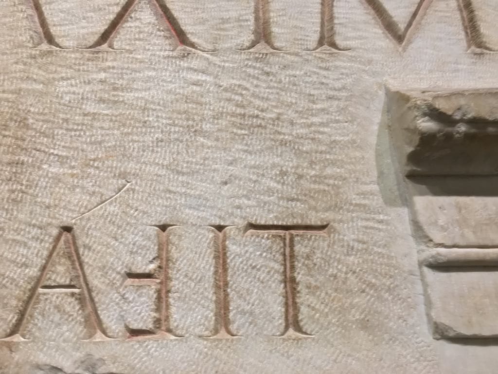
Alla fine degli anni ’80 la designer Carol Twombly studia i caratteri lapidari romani, quindi la scrittura in uso durante l’impero romano e se andate a Roma la città ne è piena, tutti i templi, le tombe e luoghi più importanti hanno incisioni su pietra realizzati secondo questo stile. Carol nei suoi studi si concentra prevalentemente sulle incisioni alla base della Colonna di Traiano e ne viene fuori un carattere classico ed elegante che dopo quasi trent’anni resta uno dei caratteri più utilizzati nel mondo della comunicazione visiva.
At the end of the 80s the designer Carol Twombly studied the Roman lapidary characters, then the writing in use during the Roman Empire and if you go to Rome the city is full of it, all the temples, the graves and most important places have engravings on stone made according to this style. In her studies Carol focuses mainly on the engravings at the base of the Trajan’s Column and what emerges is a classic and elegant character that after almost thirty years remains one of the most used characters in the world of visual communication.
Date le sue origini si capisce che il Trajan si presta benissimo per realizzare poster come quello de Il Gladiatore, ambientato in epoca romana e quindi perfettamente in linea con lo stile romano della font, al contrario di Artificial Intelligence in cui l’utilizzo è incoerente con l’argomento trattato. La prossima volta che vedrete un poster cinematografico fate caso a che carattere hanno utilizzato, magari è proprio un Trajan.
Given its origins it’s understood that the Trajan lends itself beautifully to create posters such as that of “The Gladiator”, set in Roman times and therefore perfectly in line with the Roman style of the font, as opposed to “Artificial Intelligence” in which its use is inconsistent with the topic covered. The next time you see a movie poster, notice what character they used, maybe it’s a Trajan.”
Leo Colalillo è un designer grafico laureato con la Lode all’Istituto Europeo del Design di Roma. Lavora tra Roma e Milano. I suoi lavori si trovano su MyFonts e sono pubblicati su Typodarium (2016, 2017, 2019). Web: http://leocolalillo.com/
Leo Colalillo is a graphic designer graduating with honors at the European Institute of Design in Rome. He works between Rome and Milan. His works can be found on MyFonts and are published on Typodarium (2016, 2017, 2019). Web: http://leocolalillo.com/