Lo sapevi che in italiano esiste la font (femminile) e il font (maschile)? Neanch’io! La font rappresenta il nome del carattere, mentre il font è il file tecnico con tutte le variazioni tipografiche della fonte…me lo ha spiegato mio fratello, esperto del mestiere, che qui ci parla di una font in particolare, il Trajan.
Did you know that in Italian there’s la font (feminine) and il font (masculine)? Me neither! La font represents the name of the font, while il font is the technical file with all the typographic variations of la font … my brother, an expert in the field, explained it to me and talks to us here about a particular font, the Trajan.
“Cos’è un carattere (font)? Fino a qualche decennio fa era un argomento per soli addetti al settore, ma con il computer le cose sono cambiate, di punto in bianco chiunque poteva e doveva scegliere una font con cui scrivere il suo documento, Arial, Times New Roman? Negli anni questa scelta è aumentata esponenzialmente fino ai giorni nostri, in cui tramite i social network usare una font non è solo un’esigenza ma uno strumento per esprimersi.
What’s a character (font)? Until a few decades ago it was a subject for industry professionals only, but with the computer, things changed, anyone could and had to choose a font with which to write their document, Arial, Times New Roman? Over the years, this choice has increased exponentially to the present day, in which through social networks using a font is not just a need but a tool for self-expression.
Ma voglio parlarvi di una font in particolare, il Trajan, che probabilmente non avrete usato nei vostri documenti, a meno che non siate dei grafici o non facciate comunicazione.
But I want to talk to you about a particular font, the Trajan, which you probably will not have used in your documents, unless you are a graphic designer or work in communication.
Voglio parlarvene, perché molto probabilmente a vostra insaputa l’avete vista mille volte, ad esempio al cinema, tanto da essere stata ribattezzata The Movie Font. Infatti è stata usata in film come Io sono Legenda, Unbreakable, L’Ultimo Samurai, A Beautiful Mind, The Gladiator. Il grafico Yves Peters dice che sono più di 400 i poster realizzati con questa font.
Ma veniamo al dunque.
I want to talk to you about it, because most probably you’ve seen it a thousand times before, for example at the cinema, so much so that it was renamed The Movie Font. In fact it was used in films like “I’m Legend”, “Unbreakable”, “The Last Samurai”, “A Beautiful Mind”, “The Gladiator”. The graphic designer Yves Peters says that there are more than 400 posters made with this font.
But let’s get to the point.
Se per molti Poster cinematografici il Trajan è una scelta azzeccata, per altri un po’ meno e nel caso di Artificial Intelligence totalmente errata.
Per capirlo scopriamo com’è nato il Trajan
If for many movie posters Trajan is a good choice, for others a little less, and in the case of Artificial Intelligence, it’s totally wrong. To understand this let’s discover what Trajan is and how it was born.
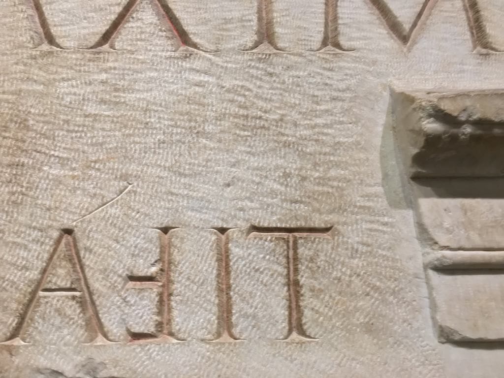
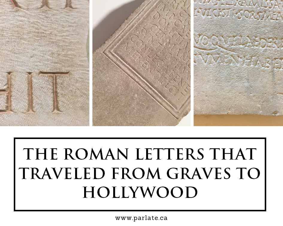
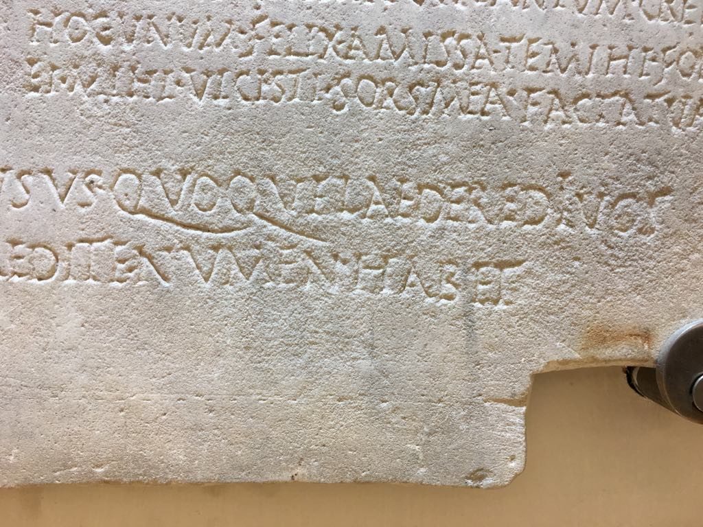
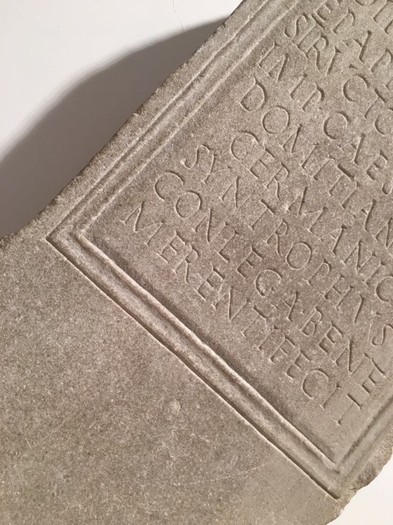
Alla fine degli anni ’80 la designer Carol Twombly studia i caratteri lapidari romani, quindi la scrittura in uso durante l’impero romano e se andate a Roma la città ne è piena, tutti i templi, le tombe e luoghi più importanti hanno incisioni su pietra realizzati secondo questo stile. Carol nei suoi studi si concentra prevalentemente sulle incisioni alla base della Colonna di Traiano e ne viene fuori un carattere classico ed elegante che dopo quasi trent’anni resta uno dei caratteri più utilizzati nel mondo della comunicazione visiva.
At the end of the 80s the designer Carol Twombly studied the Roman lapidary characters, then the writing in use during the Roman Empire and if you go to Rome the city is full of it, all the temples, the graves and most important places have engravings on stone made according to this style. In her studies Carol focuses mainly on the engravings at the base of the Trajan’s Column and what emerges is a classic and elegant character that after almost thirty years remains one of the most used characters in the world of visual communication.
Date le sue origini si capisce che il Trajan si presta benissimo per realizzare poster come quello de Il Gladiatore, ambientato in epoca romana e quindi perfettamente in linea con lo stile romano della font, al contrario di Artificial Intelligence in cui l’utilizzo è incoerente con l’argomento trattato. La prossima volta che vedrete un poster cinematografico fate caso a che carattere hanno utilizzato, magari è proprio un Trajan.
Given its origins it’s understood that the Trajan lends itself beautifully to create posters such as that of “The Gladiator”, set in Roman times and therefore perfectly in line with the Roman style of the font, as opposed to “Artificial Intelligence” in which its use is inconsistent with the topic covered. The next time you see a movie poster, notice what character they used, maybe it’s a Trajan.”

Leo Colalillo è un designer grafico laureato con la Lode all’Istituto Europeo del Design di Roma. Lavora tra Roma e Milano. I suoi lavori si trovano su MyFonts e sono pubblicati su Typodarium (2016, 2017, 2019).
Web: http://leocolalillo.com/
Leo Colalillo is a graphic designer graduating with honors at the European Institute of Design in Rome. He works between Rome and Milan. His works can be found on MyFonts and are published on Typodarium (2016, 2017, 2019).
Web: http://leocolalillo.com/
Improve your speaking and grammar while learning Italian jokes!